Sponsored Listings:
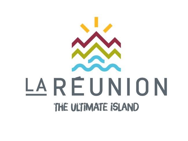
The Reunion Island Tourism Board is giving its Ultimate Island branding a facelift.
After more than a year of coexistence between the destination’s old visual identity and the pictograms used in the Ultimate Experience signature, the tourist arm of the Reunion Region has chosen the beginning of 2018 to breathe new life into its communications.
The new logo is central to the process of modernising and restructuring the image of the destination, while retaining the visual elements that sparked such keen interest around the return of the Ultimate Experience signature.
Through its missions, the RITB is required to communicate in two different capacities: the first as a destination, towards external markets, and the second as an institution, with its partners and the people of Reunion.
The aim of this update is, above all, to strengthen the local and international brand concept, greatly boosted since the last term of office began, in a strongly competitive context.
The challenge for this update is also to gain traction across all the markets covered by the RITB, raise the visibility of the competitive advantages offered by the island, and return to the international standard by designating the destination, not as Reunion Island, but as Reunion.
This name is simpler, more adaptable and easier to use across all markets from which its visitors originate.
The RITB’s new visual identity has been designed to be minimal yet memorable, combined with a sharper, more versatile arrangement of its pictograms.
This new branding is intended to be more mobile, meeting the requirements of the various communication media used by the organisation, whether physical or digital.
Source: breakingtravelnews.com

